> ## Documentation Index
> Fetch the complete documentation index at: https://revolai.mintlify.site/llms.txt
> Use this file to discover all available pages before exploring further.
# Triggers
> Create automated popups, overlays, and notification bars based on visitor behavior rules
## Overview
The Triggers tab lets you create automated actions that fire based on visitor behavior. When a visitor meets specific conditions — time on page, scroll depth, UTM source, device type, and more — the trigger displays a modal popup, toast notification, or redirects to a URL. Triggers are a powerful way to engage visitors at the right moment without any coding.
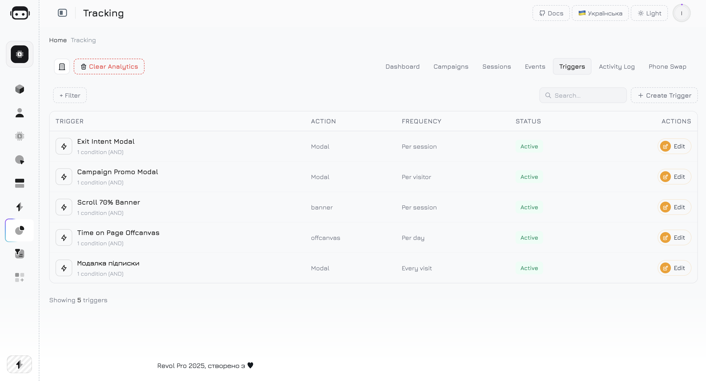
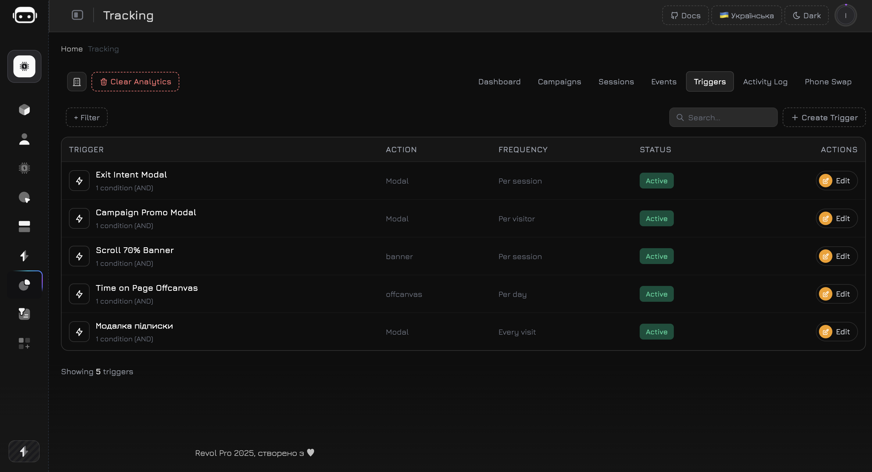 ## Triggers List
The triggers table shows all defined triggers with key metrics:
| Column | Description |
| -------------- | ----------------------------------------------------------------------------------------------- |
| **Name** | Trigger name |
| **Type** | Action type — Modal (centered popup), Toast (corner notification), or Redirect (URL navigation) |
| **Conditions** | Summary of firing conditions |
| **Fires** | Total number of activations |
| **Status** | Active or inactive |
| **Actions** | Edit or delete the trigger |
***
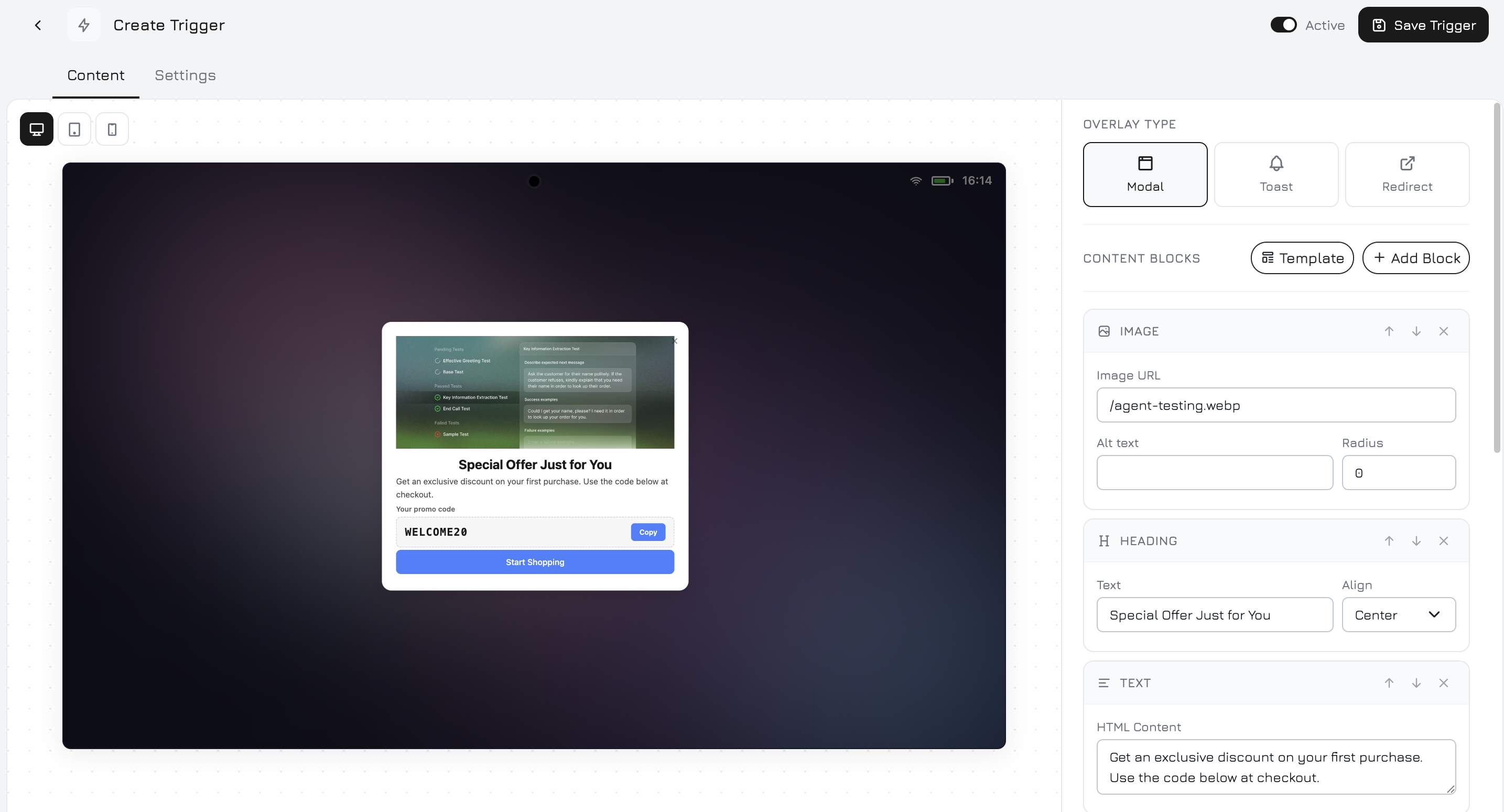
## Creating a Trigger
Click **Create Trigger** to open the trigger editor. The editor has two tabs: **Content** for visual content and **Settings** for behavior rules.
## Triggers List
The triggers table shows all defined triggers with key metrics:
| Column | Description |
| -------------- | ----------------------------------------------------------------------------------------------- |
| **Name** | Trigger name |
| **Type** | Action type — Modal (centered popup), Toast (corner notification), or Redirect (URL navigation) |
| **Conditions** | Summary of firing conditions |
| **Fires** | Total number of activations |
| **Status** | Active or inactive |
| **Actions** | Edit or delete the trigger |
***
## Creating a Trigger
Click **Create Trigger** to open the trigger editor. The editor has two tabs: **Content** for visual content and **Settings** for behavior rules.
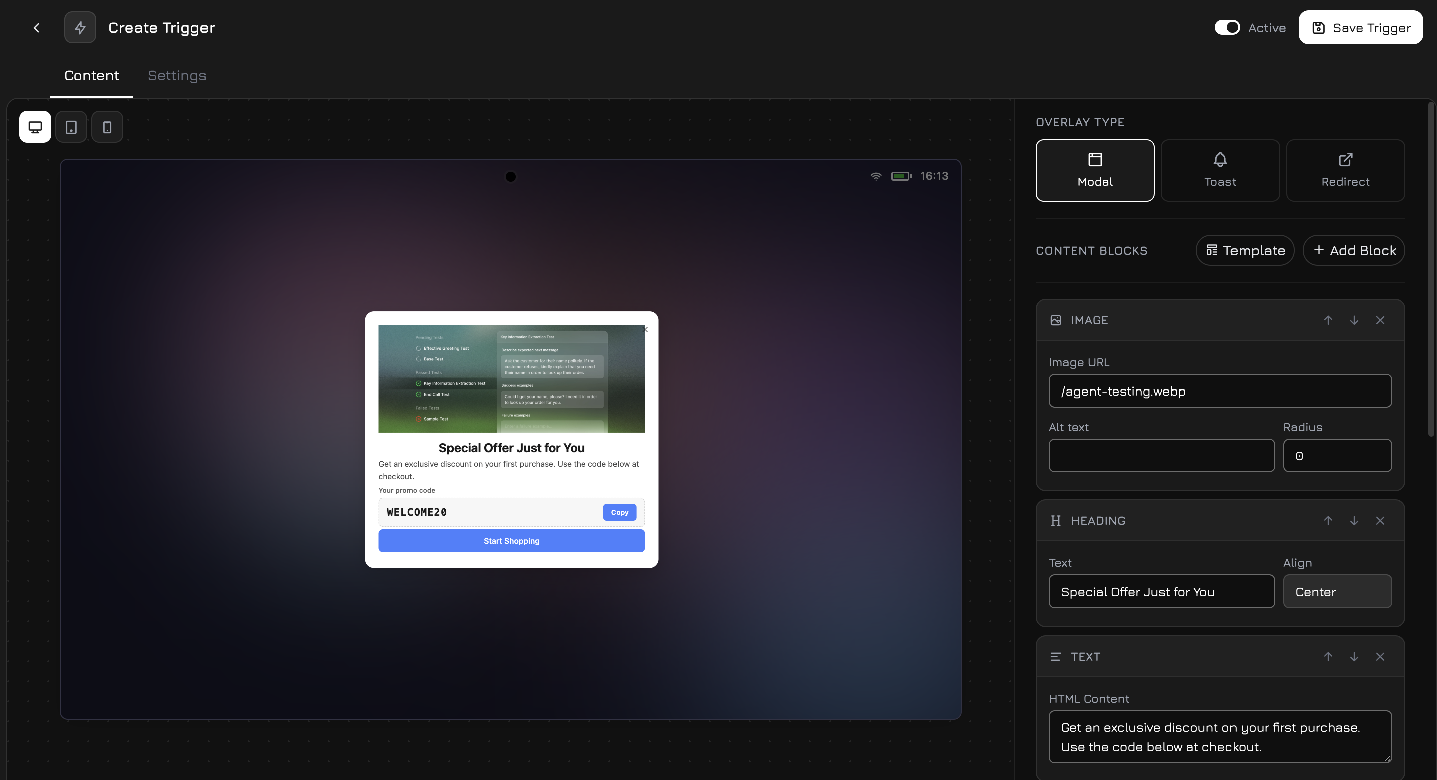 ***
## Content Tab
The Content tab is a visual block editor where you build the trigger's content. Each trigger is composed of **content blocks** that you add, arrange, and style.
### Adding Blocks
Click the **+ Add Block** button to open the block picker. Available block types:
| Block | Description |
| ---------------- | ------------------------------------------------------------------------------------------------------------------------------------------------------------------------------------------------------------ |
| **Image** | Add an image — upload a file or paste a URL. Great for product photos, banners, or icons. |
| **Heading** | Large text for titles and headlines. Supports text alignment (left or center). |
| **Text** | Body text with rich formatting. Use for descriptions, offers, or instructions. |
| **Feature List** | A bulleted list with check icons — ideal for listing benefits, features, or included items. |
| **Input Field** | A single-line text input for collecting data (name, email, phone). |
| **Textarea** | A multi-line text area for longer responses (messages, feedback). |
| **Button** | A clickable button with customizable text, color, and action (link, close, or submit form data). |
| **Promo Code** | A styled promo code block with a copy button. Visitors click to copy the code to their clipboard. |
| **QR Code** | Embeds a campaign QR code directly in the trigger. Visitors scan it on their phone to continue on mobile — with full campaign attribution. See [Campaigns — QR Code](/widget/campaigns#qr-code) for details. |
| **Divider** | A horizontal line to visually separate sections. |
### Block Settings
Each block type has its own editable properties. Click a block to select it and configure:
**Image:**
| Setting | Description |
| ----------------- | --------------------------------------- |
| **URL** | Image source URL |
| **Alt Text** | Alternative text for accessibility |
| **Border Radius** | Corner roundness in pixels (default: 0) |
**Heading:**
| Setting | Description |
| --------- | ------------------------ |
| **Text** | Heading content |
| **Align** | Left (default) or Center |
**Text:**
| Setting | Description |
| ---------------- | ---------------------------------------------------------------------------------- |
| **HTML Content** | Rich text with formatting — supports ``, ``, ``, ``, lists, and `
***
## Content Tab
The Content tab is a visual block editor where you build the trigger's content. Each trigger is composed of **content blocks** that you add, arrange, and style.
### Adding Blocks
Click the **+ Add Block** button to open the block picker. Available block types:
| Block | Description |
| ---------------- | ------------------------------------------------------------------------------------------------------------------------------------------------------------------------------------------------------------ |
| **Image** | Add an image — upload a file or paste a URL. Great for product photos, banners, or icons. |
| **Heading** | Large text for titles and headlines. Supports text alignment (left or center). |
| **Text** | Body text with rich formatting. Use for descriptions, offers, or instructions. |
| **Feature List** | A bulleted list with check icons — ideal for listing benefits, features, or included items. |
| **Input Field** | A single-line text input for collecting data (name, email, phone). |
| **Textarea** | A multi-line text area for longer responses (messages, feedback). |
| **Button** | A clickable button with customizable text, color, and action (link, close, or submit form data). |
| **Promo Code** | A styled promo code block with a copy button. Visitors click to copy the code to their clipboard. |
| **QR Code** | Embeds a campaign QR code directly in the trigger. Visitors scan it on their phone to continue on mobile — with full campaign attribution. See [Campaigns — QR Code](/widget/campaigns#qr-code) for details. |
| **Divider** | A horizontal line to visually separate sections. |
### Block Settings
Each block type has its own editable properties. Click a block to select it and configure:
**Image:**
| Setting | Description |
| ----------------- | --------------------------------------- |
| **URL** | Image source URL |
| **Alt Text** | Alternative text for accessibility |
| **Border Radius** | Corner roundness in pixels (default: 0) |
**Heading:**
| Setting | Description |
| --------- | ------------------------ |
| **Text** | Heading content |
| **Align** | Left (default) or Center |
**Text:**
| Setting | Description |
| ---------------- | ---------------------------------------------------------------------------------- |
| **HTML Content** | Rich text with formatting — supports ``, ``, ``, ``, lists, and `
` |
**Feature List:**
| Setting | Description |
| --------- | ------------------------------------------------------------------------------------------------------------------- |
| **Items** | Dynamic list of features. Each item has an icon (emoji), title, and description text. Click "Add Item" to add more. |
**Input Field:**
| Setting | Description |
| --------------- | -------------------------------------------------- |
| **Key** | Form field name (e.g., `email`, `phone`) |
| **Type** | Text, Email, Phone, or Number |
| **Label** | Field label shown above the input |
| **Placeholder** | Hint text inside the field |
| **Required** | Whether the field must be filled before submission |
**Textarea:**
| Setting | Description |
| --------------- | ---------------------------------------------- |
| **Key** | Form field name |
| **Rows** | Number of visible text rows (1–10, default: 3) |
| **Label** | Field label |
| **Placeholder** | Hint text |
| **Required** | Whether the field must be filled |
**Button:**
| Setting | Description |
| ----------- | -------------------------------------------------------------------------------------------------------------------------- |
| **Label** | Button text |
| **Variant** | Primary (solid accent color), Secondary (light tint), or Outline (transparent with border) |
| **Action** | Close (dismiss trigger), Open Link (navigate to URL), Submit Form (send form data), or Copy Value (copy text to clipboard) |
| **Value** | URL for links or text for copy action |
**Promo Code:**
| Setting | Description |
| --------- | -------------------------------------- |
| **Code** | The promo code text (e.g., `SPRING20`) |
| **Label** | Optional label above the code |
**QR Code:**
| Setting | Description |
| ----------- | -------------------------------------------------------------- |
| **QR Data** | URL or text to encode. Use the "Create QR" button to generate. |
| **Size** | QR code size in pixels (default: 160) |
**Divider:**
No settings — renders a horizontal line separator.
### Trigger Style
The trigger container has global style settings that apply to the entire popup/toast:
| Setting | Description |
| -------------------- | ----------------------------------------------------------------------------------------------------------------------- |
| **Background Color** | Container background (default: `#ffffff`) |
| **Text Color** | Default text color for all blocks (default: `#1a1a1a`) |
| **Accent Color** | Color for buttons, feature icons, and promo code copy button (default: `#4680ff`) |
| **Border Radius** | Corner roundness of the entire trigger in pixels (default: 16) |
| **Position** | For toast-style triggers: top-right, top-left, bottom-right, or bottom-left. For modals: centered with a dark backdrop. |
### Content Examples
* **Heading**: "Get 10% Off Your First Order"
* **Text**: "Subscribe to our newsletter and receive an exclusive discount code."
* **Input Field**: Email
* **Button**: "Get My Discount" (submit action)
* **Promo Code**: Revealed after form submission
* **Image**: Product photo
* **Heading**: "Wait! Don't miss this."
* **Text**: "Free shipping on orders over \$50 — today only."
* **Button**: "Shop Now" (link to store)
* **Button**: "No thanks" (close action)
* **Heading**: "Continue on your phone"
* **Text**: "Scan the QR code to chat with our AI agent on mobile."
* **QR Code**: Campaign QR code with UTM tracking
* **Text**: "Or click the chat button below."
* **Image**: Feature screenshot
* **Heading**: "New: AI-Powered Recommendations"
* **Feature List**: 3-4 key benefits
* **Button**: "Learn More" (link to feature page)
* **Divider**
* **Text**: Small print disclaimer
***
## Settings Tab
The Settings tab controls **when**, **how often**, and **to whom** the trigger is shown.
### Conditions
Conditions define the rules that must be met for the trigger to fire. You can add multiple conditions and choose the logic mode: **AND** (all conditions must be true) or **OR** (any condition is enough) for the trigger to activate.
| Condition | Operator | Description |
| -------------------------- | ----------------------------------------- | -------------------------------------------------------------------------------------------------------------------- |
| **Time on page (seconds)** | `>=`, `<=`, `=` | Fire after the visitor spends X seconds on the current page. Example: show a popup after 30 seconds of reading. |
| **Pages visited** | `>=`, `<=`, `=` | Fire after the visitor views X pages in the session. Example: show an offer after they browse 3+ pages. |
| **Scroll depth (%)** | `>=`, `<=`, `=` | Fire when the visitor scrolls past a percentage of the page. Example: show a CTA after 70% scroll. |
| **UTM Source** | `=`, `contains` | Fire only for visitors from a specific traffic source. Example: show a special offer only for `google` visitors. |
| **UTM Medium** | `=`, `contains` | Fire only for a specific marketing medium. Example: trigger only for `cpc` (paid) traffic. |
| **UTM Campaign** | `=`, `contains` | Fire only for visitors from a specific campaign. Example: show a seasonal banner only for `summer-sale` campaign. |
| **Referral ID** | `=`, `!=` | Fire based on the `rvl_ref` parameter. Example: show a partner welcome message for a specific referral. |
| **Referrer contains** | `contains` | Fire based on the referring URL. Example: show a competitor comparison for visitors coming from a competitor's site. |
| **Page URL** | `=`, `contains`, `starts_with`, `matches` | Fire only on specific pages. Use `matches` for regex patterns. Example: show a pricing popup only on `/pricing`. |
| **Device type** | `=` | Fire only on Desktop, Mobile, or Tablet. Example: show a mobile app download banner only on mobile. |
| **Event fired** | `=` | Fire after a specific tracking event occurs. Example: show a cross-sell popup after `add_to_cart` event. |
| **Day of week (0=Sun)** | `=`, `in` | Fire only on specific days. Example: show weekend deals on Saturday (6) and Sunday (0). |
| **Hour range \[from, to]** | `between` | Fire only during specific hours. Example: show "Call us now" only during business hours 9-18. |
### Condition Examples
Show a newsletter popup to visitors who are actively reading:
| Condition | Operator | Value |
| ------------ | -------- | --------- |
| Time on page | `>=` | `30` |
| Scroll depth | `>=` | `50` |
| Device type | `=` | `desktop` |
Show a special discount for Google Ads visitors on the pricing page:
| Condition | Operator | Value |
| ---------- | ---------- | ---------- |
| UTM Source | `=` | `google` |
| UTM Medium | `=` | `cpc` |
| Page URL | `contains` | `/pricing` |
Show a reminder after an add-to-cart event with time delay:
| Condition | Operator | Value |
| ------------- | -------- | ------------- |
| Event fired | `=` | `add_to_cart` |
| Time on page | `>=` | `60` |
| Pages visited | `>=` | `2` |
Show a "Call us" bar only during working hours on weekdays:
| Condition | Operator | Value |
| ----------- | --------- | ----------------- |
| Hour range | `between` | `[9, 18]` |
| Day of week | `in` | `[1, 2, 3, 4, 5]` |
| Device type | `=` | `desktop` |
### Frequency
Controls how often the trigger is shown to the same visitor:
| Option | Description |
| --------------------------- | ------------------------------------------------------------------------------------------------------------------------------------------------------- |
| **Once per session** | Show once during the current browser tab session. The trigger won't show again even after page reload or navigation — only closing the tab resets it. |
| **Once per day** | Show once per calendar day. The visitor won't see it again until tomorrow, regardless of how many sessions they have today. |
| **Once per visitor (ever)** | Show only once — ever. Once a visitor has seen this trigger, it will never show again (tracked via browser token). Ideal for one-time announcements. |
| **Every visit** | Show on every session. The trigger fires every time the conditions are met, regardless of how many times the visitor has seen it before. Use sparingly. |
For most use cases, **Once per session** or **Once per visitor** is the right choice. "Every visit" can be annoying — use it only for critical, time-sensitive information like maintenance notices or urgent promotions.
### Schedule
Optionally restrict the trigger to a specific date and time range:
| Field | Description |
| ------------ | --------------------------------------------------------------------------------------------------------------------- |
| **Start At** | Date and time when the trigger becomes active. Before this moment, the trigger won't fire even if conditions are met. |
| **End At** | Date and time when the trigger stops. After this moment, the trigger is automatically deactivated. |
Both fields are optional:
* **Start only** — the trigger activates on the start date and runs indefinitely
* **End only** — the trigger runs immediately and stops on the end date
* **Both** — the trigger runs only during the specified window
* **Neither** — the trigger runs as long as it's enabled
**Use cases for scheduling:**
| Scenario | Start | End |
| --------------------------- | ------------- | ------------- |
| Black Friday sale popup | Nov 29, 00:00 | Dec 2, 23:59 |
| New Year promo banner | Dec 25, 00:00 | Jan 5, 23:59 |
| Product launch announcement | Mar 15, 10:00 | Mar 22, 23:59 |
| Maintenance notice | — | Apr 1, 06:00 |
***
## How Triggers Work
When the tracker script loads on your website, it fetches the active trigger definitions and evaluates them in the background:
The tracker fetches active trigger definitions from the server. The server filters by schedule (start/end dates) and active status before sending them to the client.
Every 2 seconds, the tracker checks each trigger's frequency setting. If the visitor has already seen the trigger (based on localStorage or sessionStorage), the trigger is skipped.
For triggers that pass the frequency check, the tracker evaluates all conditions — time on page, scroll depth, UTM parameters, device type, fired events, and more. Conditions use AND or OR logic depending on configuration.
The trigger content (modal or toast) is rendered on the page inside a Shadow DOM with the configured styling and animation. The activation is recorded as a `trigger_shown` event. For redirect triggers, the visitor is navigated to the target URL.
The visitor can interact with the trigger — click buttons, fill in fields, copy promo codes, scan QR codes, or close it. Each interaction is tracked as a separate event (`trigger_clicked`, `trigger_dismissed`, `trigger_promo_copied`).
Triggers are rendered inside their own **Shadow DOM** container, so their styles are fully isolated from your website. No CSS conflicts.
***
## Triggers and Events Integration
Triggers create tracking events automatically. Every trigger activation is recorded as a `trigger_shown` event with the trigger ID and action type. You can:
* See trigger activity in the **Trigger Activity** chart on the Dashboard
* View trigger activations in the **Campaign Performance** table
* Use the `event_fired` condition to chain triggers — e.g., show Trigger B only after Trigger A was seen
* Combine with [Custom Events](/widget/events#custom-events-api) for complex flows
Use the **Event fired** condition to create multi-step sequences. For example: Trigger 1 shows a teaser after 10 seconds. Trigger 2 shows the full offer only if the visitor clicked Trigger 1's button (tracked as a custom event).